By Václav Lorenc · CEO, Byzkids · Published September 18, 2026
Web to App Conversion Blueprint: Win Web and Offline Users
A practical framework for moving existing web, self-care portal and offline customers into your banking or telco app, covering timing, open app mode and the message framework.
BLUEPRINT AT A GLANCE
- Topic: Moving existing web, self-care portal and offline customers into the mobile app
- Audience: Product managers, digital heads, growth and marketing strategists in banking and telco
- Time to read: 6 minutes
- Innovations referenced: 3 real-world examples on this page, 4,000+ in the Byzzard database
- Segments covered: Web and self-care portal users, offline and kiosk customers
1. Executive summary
Important: Two customer segments hold the largest untapped app conversion opportunity in banking and telco. Web and self-care portal users are already digital but stuck in habit, and offline or kiosk customers have never been given a compelling reason to switch. Getting both into the app is primarily a timing and message problem, not a technology problem.
Mobile app adoption among existing customers does not happen organically. Operators and banks that have studied it find the same pattern: a large share of customers using the self-care portal or a physical point of sale have never downloaded the app, not because they rejected it, but because they were never caught at the right moment with the right message.
This blueprint covers the pre-activation layer: how to catch both segments, what to say, and how open app mode removes the login wall that stops a fresh install. For what happens after the install, see the mobile account opening blueprint and the new customer activation blueprint.
KEY TAKEAWAYS
- Web and self-care portal users are one well-timed nudge away: the post-transaction confirmation screen is the highest-converting touchpoint
- Offline customers respond to pain-point framing at the moment of friction, not to generic benefit messaging
- Open app mode lets a new install explore the product before registering, so the login step arrives with a reason attached
- Three message types drive action: in-app only feature, in-app reward and mobile enabler
2. Topic overview and scope
This blueprint covers the pre-activation layer of mobile app conversion for banks and operators: everything that happens before a customer reaches your app activation funnel. It focuses on two distinct segments, existing web and self-care portal users who are already digital but have not downloaded the app, and offline or kiosk customers who transact physically and have never been given a reason to switch.
In scope
- Segment definition for web and self-care portal users and for offline and kiosk customers
- Timing: when a prompt converts, and when it damages the relationship
- Open app mode: the product pattern that lets customers browse the app before they register
- Message framework: the three conversion message types and the copy principles behind them
3. Problem framing and segment definition
The strategic mistake most teams make is treating web and offline customers as a single audience for app conversion. They are not. Their barriers to adoption are fundamentally different, and so are the levers that move them.
| Web and self-care portal users: the inertia problem | Offline and kiosk customers: the behaviour change problem |
|---|---|
| Already digital. Already doing the task. The barrier is habit and the lack of a compelling reason to switch channel. They are one well-timed nudge away from conversion. Key lever: catch them at peak satisfaction, immediately after a task succeeds. | Chose the physical channel for a reason: habit, distrust, or low digital confidence. Positioning the app as additive, not as a replacement, is critical. Key lever: activate at peak pain, at the queue, the kiosk, the wait. |
The catch, convert and hook framework
Every successful pre-activation mechanic follows the same three-beat structure. The sequence is not optional: skipping any stage collapses conversion.
| 01 Catch | 02 Convert | 03 Hook |
|---|---|---|
| Intercept at a high-intent moment. Web: the post-payment confirmation. Offline: the point of sale or the queue. The customer is engaged, not distracted. | One-tap path. A deep link that opens the exact feature they just used, not the app homepage. Pre-filled authentication. QR or SMS, never both on the same surface. | Immediate, tangible first-session value. A reward, a completed task, a feature unavailable in the old channel. The reason they come back. |
Timing: the single biggest variable
Showing an app migration prompt at the wrong moment is not neutral. It actively damages conversion by creating negative associations before the customer has tried the app.
Web and self-care portal users: prompt after task success, never before it. The confirmation screen is optimal: satisfaction is at its peak, there is no task anxiety, and the customer has a natural pause. A banner mid-form is an interruption. The same banner after confirmation is a natural next step.
Offline and kiosk customers: activate at peak pain, not at peak convenience. The queue is the pitch. A customer who has just waited in line or wrestled with a kiosk interface is at their most receptive to hearing there is a better way.
4. Open app mode: let customers explore before they sign up
Open app mode lets a customer open a freshly installed app and browse the full interface before creating an account, with a login prompt that is always visible but never blocks navigation. It is not a guest account and not a separate demo build: it is the real app rendered with placeholder data. It solves the biggest single loss point in app conversion, the login wall that meets a new install before the customer has seen any value.
The sequence shift
Standard flow: install, login wall, drop-off, registration, first value.
Open app flow: install, explore, find a reason to register, contextual login prompt, registration, first value that the customer has already seen.
The customer reaches the login step with a specific reason to complete it. That is why open app mode produces higher registration rates: not because it removes friction mechanically, but because it gives the customer a reason to overcome it.
Design principles
- The login prompt must never be a full-screen gate. Keep it a persistent banner or an inline card that appears at the moment of transactional intent.
- Placeholder data must be visually convincing: realistic balance figures, a chart with a plausible shape, a usage bar at a believable level.
- Session state created in explore mode must survive the login step. What the customer selected or configured is restored, not discarded.
How banks and operators apply it
Open app with a persistent login prompt | Optus · AUS
Optus lets customers explore the full app without logging in: dashboard, usage overview, plan details and billing, all shown with illustrative placeholder data. A persistent, non-blocking prompt invites them to log in and see their real numbers, framed as an upgrade to personalised information rather than a registration requirement.
 Screen unavailable
Pre-login app experience as acquisition funnel
by Optus
Optus AUS opens the app to non-customers with a "New to Optus?" entry that showcases a network coverage map, living network features like call translate and turbocharge, SubHub subscription management, Optus sport, a device shop, and prepaid activation. The pre-login experience turns the self-care app into a brand showcase and acquisition funnel, letting prospects explore the full value proposition before signing up.
Homepage as app download page | AT&T (myAT&T) · USA
AT&T's consumer website makes the app the dominant call to action. The hero section leads with the myAT&T app rather than the product catalogue or a promotional offer: a large phone mockup, a headline about app-delivered convenience, and App Store and Play Store buttons as the primary CTAs.
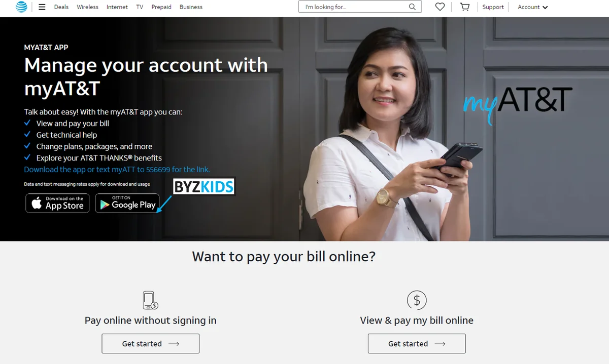
Homepage mobile app priority CTA strategy
by AT&T
AT&T USA prioritizes its mobile app by making it the primary call-to-action on the homepage. It shifts focus from traditional web journeys to app-led engagement with a bold, prominent prompt—creating a “mobile-first” wow effect that accelerates digital migration.
Point-of-sale QR with an instant in-app reward | OMV · International
OMV places QR codes at its physical points of sale with one value-first message: scan, download the app, and get the saving on your next purchase as soon as you register. A deferred deep link opens the app on the savings screen after install, so the reward is visible immediately.
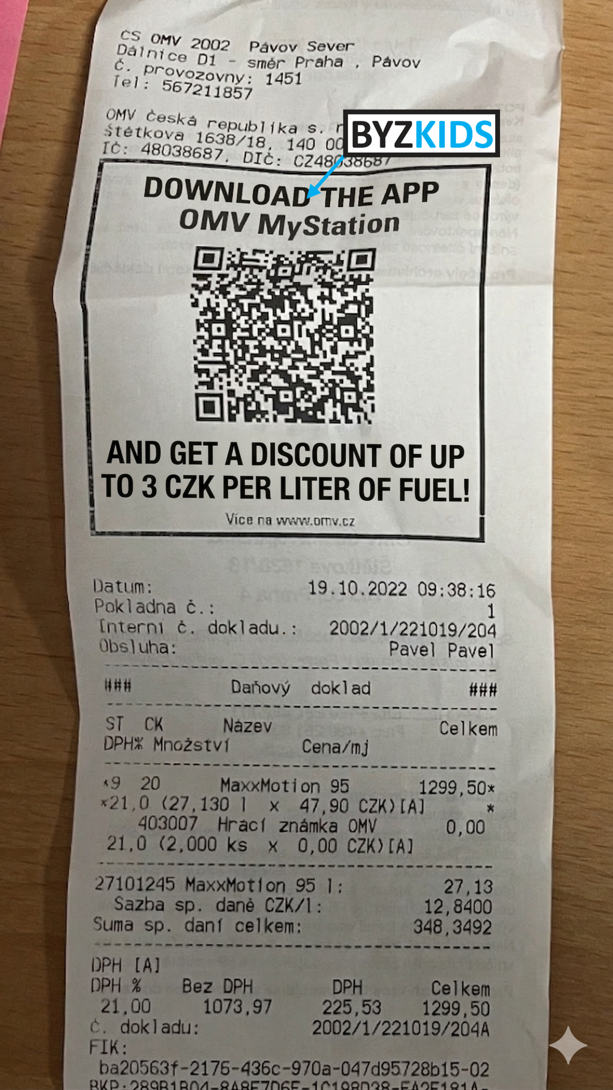
QR code scan-to-save app download incentive
by OMV
OMV AUT places QR codes in physical locations that lead directly to app download, paired with discounts available only in the app. It creates a powerful scan-to-save moment, blending offline and digital with a wow effect that instantly rewards action and boosts adoption.
5. Message types and copy framework
The channel gets the customer's attention. The message determines whether they act. There are three distinct message types, each targeting a different motivational driver. The most effective pre-activation campaigns use all three, matched to the right segment and channel.
The three conversion message types
| In-app only feature | In-app reward | Mobile enabler |
|---|---|---|
| Something the customer cannot do on web or at a kiosk. The app is the only path. Creates pull through loss aversion: 'I am missing this.' Show the locked feature prominently in the self-care portal. | A tangible, immediate incentive tied to the first app action: account credit, free data, loyalty points. It must be delivered within the first session, because deferred rewards lose most of their effect. | A capability only possible on mobile hardware: Face ID, camera QR payments, location alerts, push notifications. The phone is the reason, not just a convenient channel. |
Copy framework: weak versus strong framing
The copy framework determines how to say it. The most common failure is generic benefit language, such as 'manage your account anywhere', which registers as background noise. Always name the specific pain instead of describing the general benefit.
| Driver | Weak framing | Strong framing |
|---|---|---|
| Time saving | 'Manage your account faster' | 'Pay in 10 seconds, no queue, no login' |
| Effort | 'Everything in one place' | 'You have logged in 6 times this month. Face ID does it in one tap.' |
| Control | 'Stay on top of your account' | 'Get notified the moment your data runs low' |
| Social proof | 'Join our digital community' | 'Rated 4.7, with 850,000 customers already using it' |
| Loss aversion | 'Get exclusive app features' | 'This feature is not available on web, app only' |
| Pain (offline) | 'Manage everything from home' | 'Skip this queue. Forever.' |
Three rules for pre-activation copy:
- Name the pain. Reference the specific friction the customer has just experienced. Generic copy is ignored, contextual copy is read. 'You have just waited 8 minutes' beats 'Save time'.
- One CTA only. A QR code or a button, never both, and never 'learn more'. Every extra decision point costs roughly a third of the conversion.
- Make it reversible. 'Try the app, you can always use the till too.' Removing commitment anxiety is the single most effective copy addition for offline customers.
EXPLORE MORE ON BYZZARD
This public blueprint covers the two segments, the timing, open app mode and the message framework. The full blueprint adds the complete channel and touchpoint map for both segments, seven ready-to-run campaign briefs, a 90-day pilot roadmap and the KPI framework with benchmarks, plus the other 14 web-to-app and offline conversion examples. Everything sits alongside 4,000+ innovations in the Byzzard database.
byzzard.com | September 2026 | V1.0
Frequently asked questions
Related blueprints
Book a demo for free
Want to experience whole Byzzard innovation hub?
Get access to 4,000+ innovations, blueprints on various topics and our closed AI model APEX for free.