
Homepage mobile app priority CTA strategy
AT&T
AT&T USA prioritizes its mobile app by making it the primary call-to-action on the homepage. It shifts focus from traditional web journeys to app-led engagement with a bold, prominent prompt—creating a “mobile-first” wow effect that accelerates digital migration.
Innovation Metrics
50%
Penetration
0.00€
Willingness to pay
8%
Customer growth
Want to explore this innovation further?
Part of Byzzard's framework
This innovation is featured in one of our blueprints.
Similar Innovations
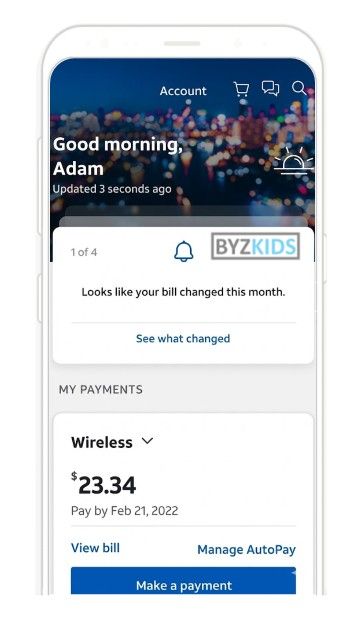
Personalized greeting with proactive billing alerts
by AT&T
AT&T USA dashboard features a personalized greeting with customer name that makes the app feel more human and service-oriented from the first screen. The top navigation gives instant access to profile settings, notifications, and support/chat tools, reducing friction when customers need help or want to manage preferences. The notification inbox is visually prioritized through a dedicated alert card that proactively explains billing changes instead of forcing users to search for them manually. A simplified single-product payment overview keeps the focus on core account actions while creating more space for alerts, support, and self-service tools.
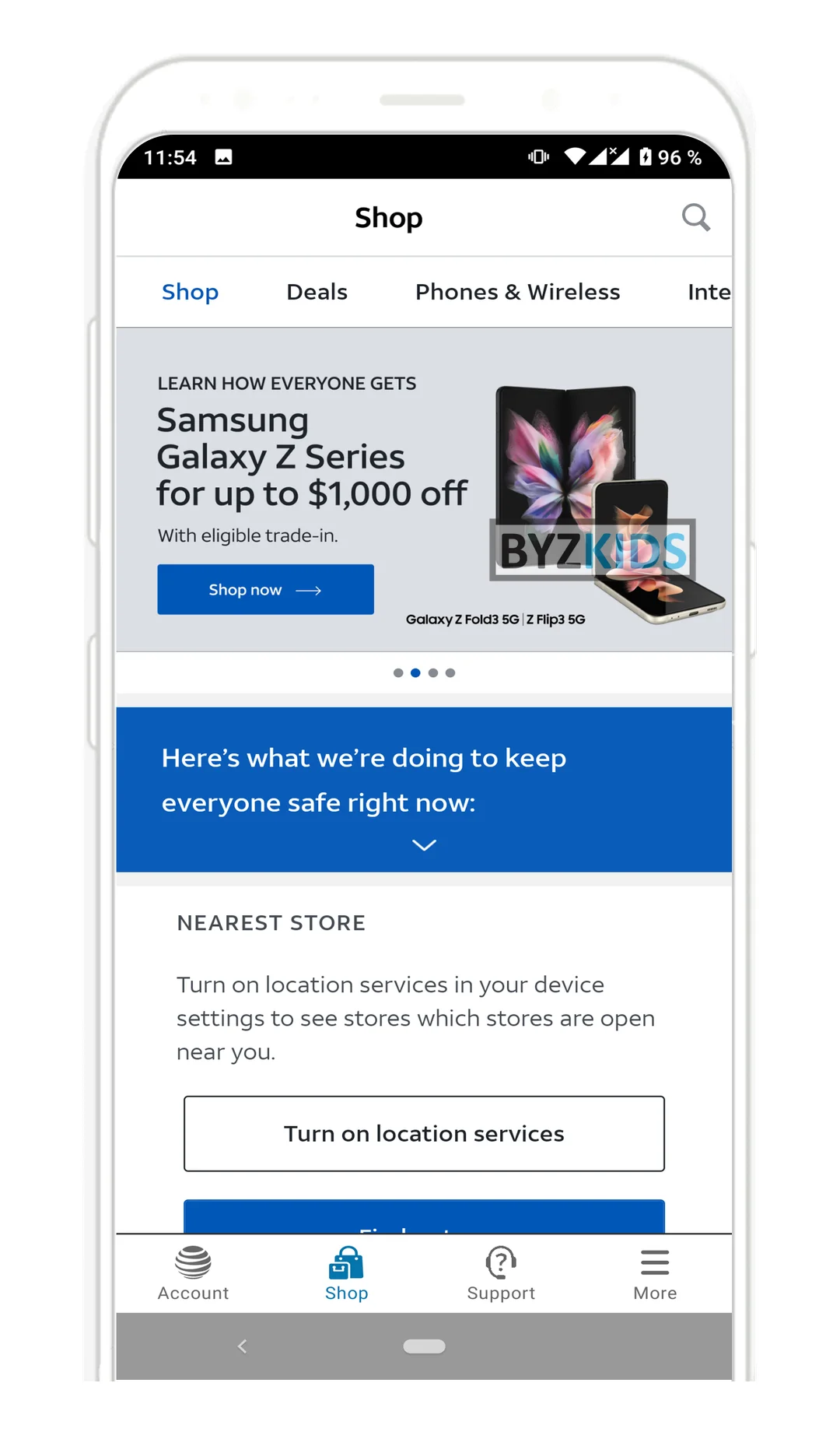
Persistent Shop tab in primary bottom navigation
by AT&T
AT&T USA launches a dedicated Shop tab embedded directly in the app's primary bottom navigation bar, elevating device deals and trade-in offers to the same visibility level as Account and Support. The feature ensures hardware promotions are passively surfaced to users during every app session rather than requiring deliberate browsing intent. The key differentiator is the persistent placement strategy, which transforms the app into a continuous retail touchpoint without disrupting core service navigation.
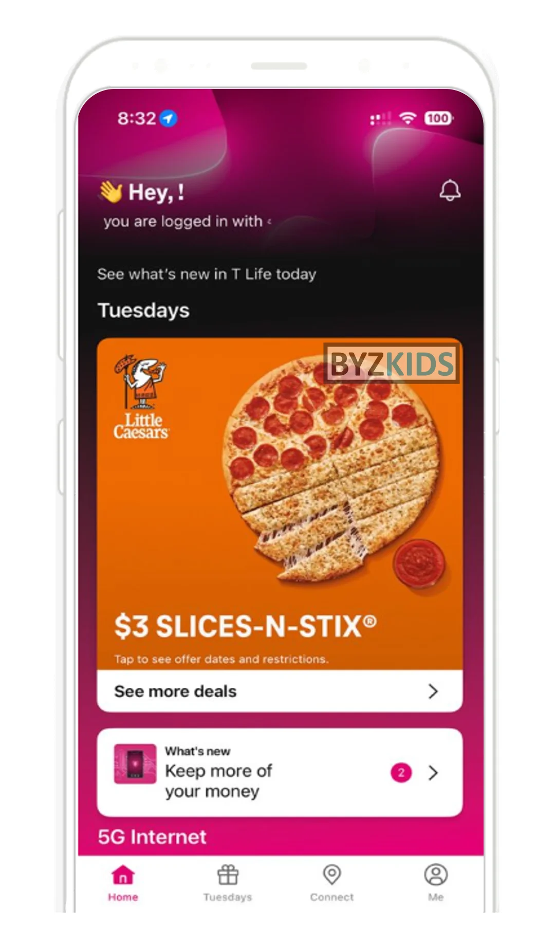
Proactive next best action dashboard widget
by T-Mobile
T-Mobile USA launches a next best action widget prominently placed at the top of the customer dashboard, surfacing personalized recommendations and critical alerts in real time. The feature guides users toward relevant in-app actions or important account notifications without requiring them to navigate manually. The main differentiator is its proactive, context-aware approach that reduces friction and keeps customers informed at a glance.
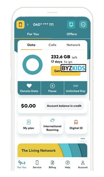
Personalized homepage action buttons based on behavior
by Optus
Optus AUS personalizes homepage action buttons based on each customer’s needs and behavior. The app surfaces the most relevant next steps, a wow factor that makes the interface feel proactive and intuitive, improving speed and satisfaction in everyday interactions.
Unified AI chat and search homepage entry point
by T-Mobile
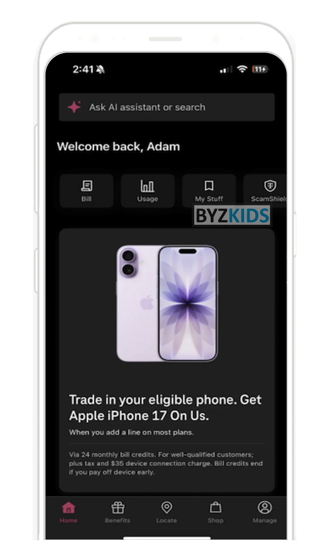
T-Mobile USA launches a prominently placed AI chat assistant at the top of its homepage, serving as both a conversational support tool and an intelligent search bar. Customers are prompted to type questions or search queries, both of which activate the AI assistant seamlessly. The key differentiator is the unified entry point that merges search and chat into a single, proactive AI-driven interface on the main landing page.
Personalized loyalty banner
by Verizon
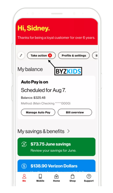
Verizon USA added a homepage banner showing customer tenure and launched top action buttons guiding customers to recommended account tasks.
Promo Banner
by Unnamed Company
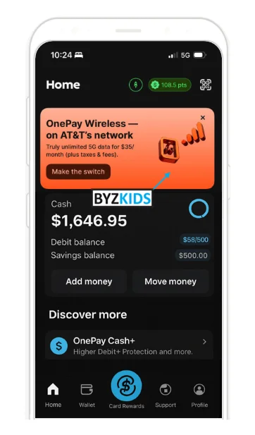
A prominent homepage promo banner leads users directly into a complete wireless signup flow.
OOH banners drive app downloads via exclusive rewards
by Vodafone
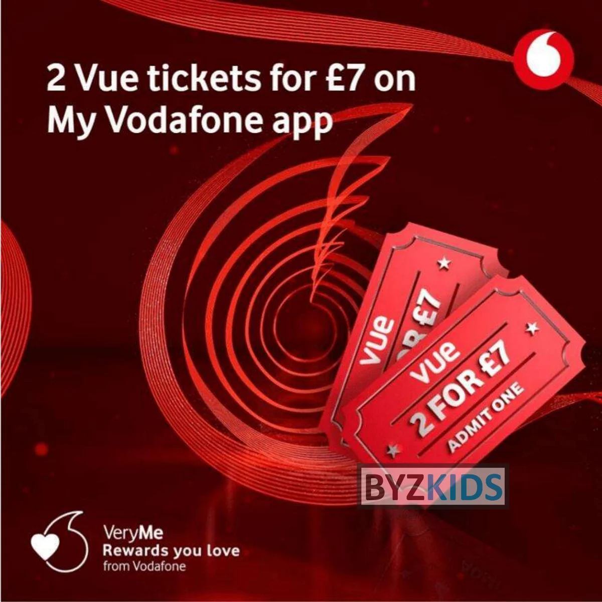
Vodafone GBR launches an offline-to-digital loyalty activation by promoting app-exclusive VeryMe Rewards deals — such as two Vue cinema tickets for £7 — via physical out-of-home banners. The offers are redeemable only inside the My Vodafone app, creating a direct incentive for downloads and engagement with the rewards section. The key differentiator is using a concrete, high-value offer as the hook rather than generic 'download our app' messaging.

Offline media funnels users to loyalty app enrollment
by Verizon
Verizon USA launches an offline-to-digital rewards acquisition strategy, promoting its Verizon Up loyalty program through billboards and print ads with explicit app-enrollment calls to action. The campaign highlights app-exclusive perks to convert passive offline audiences into active mobile app users. The key differentiator is the deliberate use of traditional media as a funnel for mobile engagement and long-term retention.
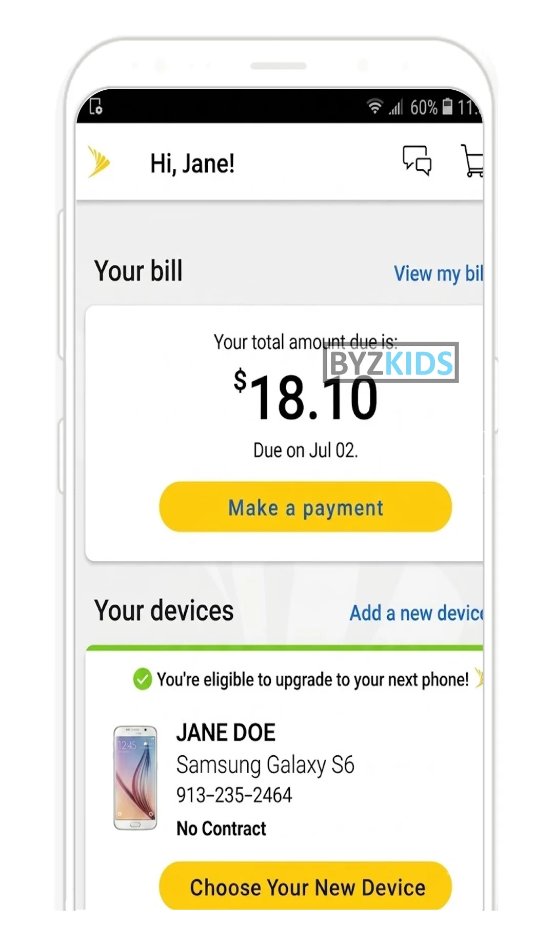
Contextual device upgrade prompt in billing section
by Sprint
Sprint USA launches a contextual device upgrade prompt positioned directly below the billing section on its app homepage. The feature pairs an eligibility notice with the user's current phone details and a 'Choose Your New Device' call-to-action, surfacing the upsell at the moment of highest engagement. By anchoring the upgrade path to routine payment activity, Sprint reduces friction and increases visibility without requiring users to navigate away from account management.
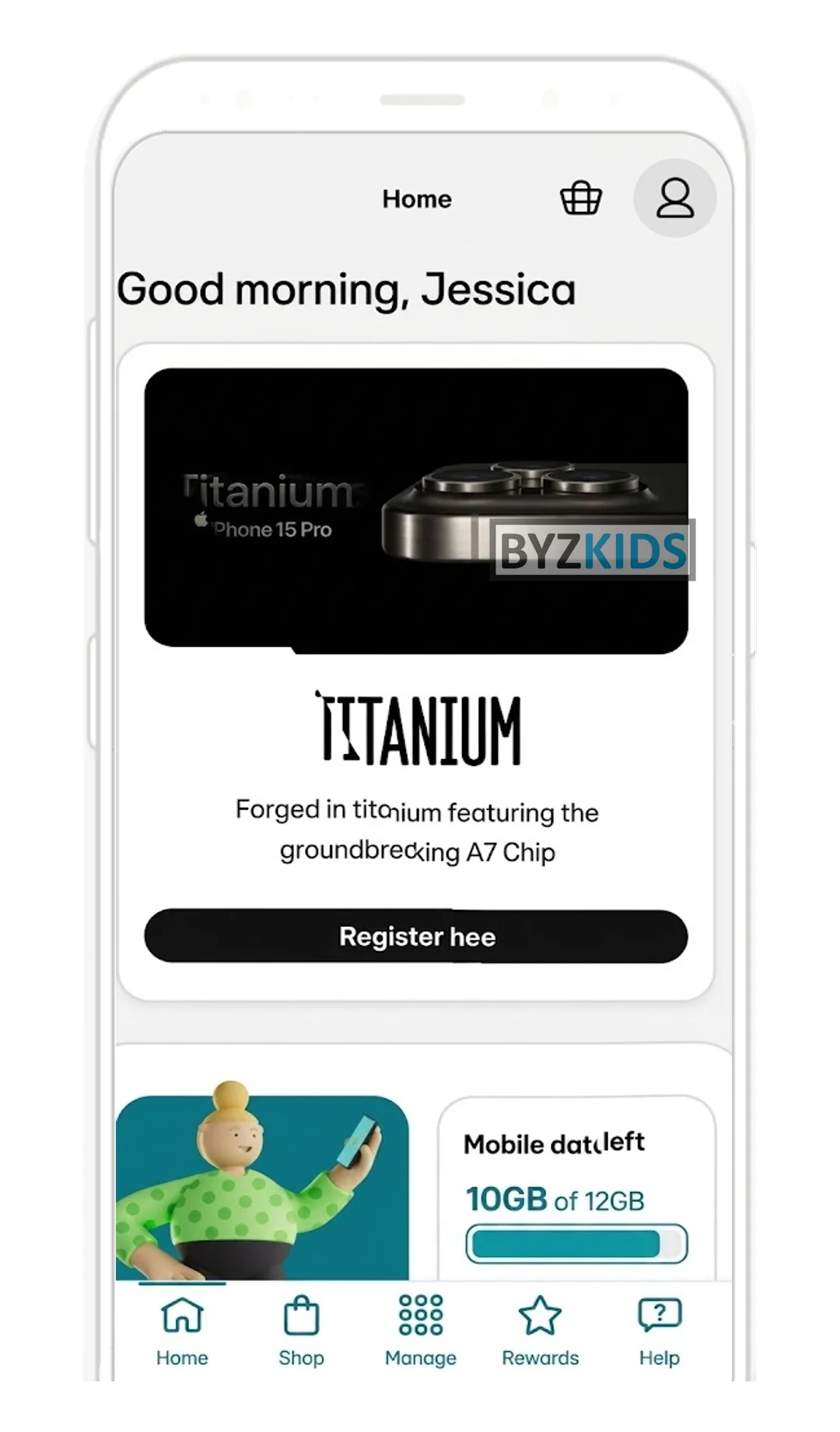
Homepage device upgrade banner with direct registration
by EE
EE GBR launches a prominent device upgrade banner on its app homepage, displaying the latest available handset alongside a direct registration link positioned immediately below the user greeting. The placement ensures hardware offers are visible during every app session, regardless of the user's original intent. By integrating upgrade prompts into routine account interactions, EE converts everyday check-ins into active sales touchpoints without requiring a dedicated marketing campaign.
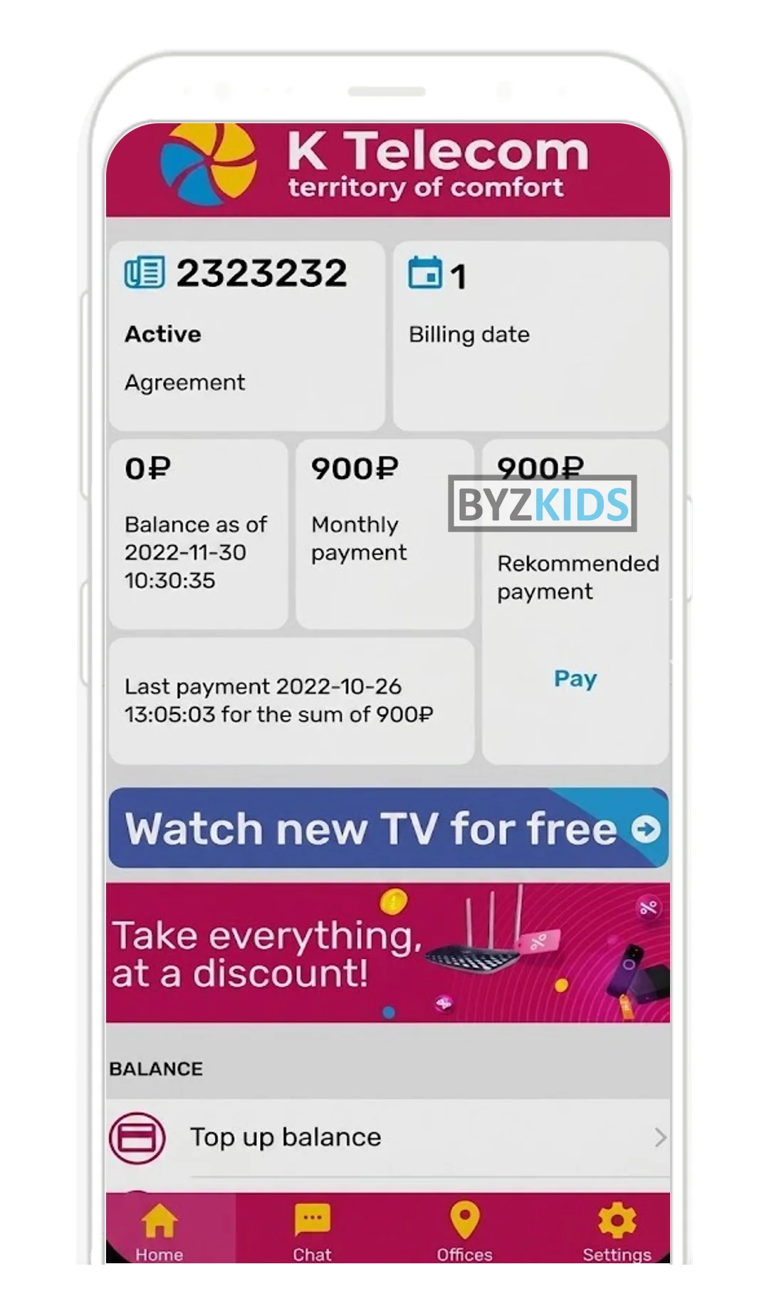
Targeted cross-sell banners for bundled packages
by K Telecom
K Telecom RUS launches targeted cross-sell banners on its app home screen, promoting TV subscriptions and bundled multi-product packages to existing internet subscribers. The banners are strategically positioned below account and payment details on the high-traffic overview page to maximize visibility. The key differentiator is leveraging an already-engaged user touchpoint to surface upsell opportunities without disrupting core account management flows.
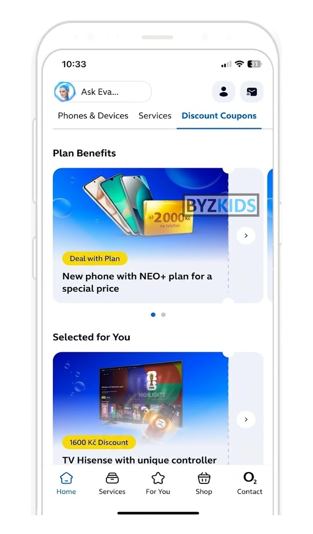
Home screen embedded storefront with intent-based navigation
by O2
O2 CZE launches an in-app storefront embedded directly on the home screen, placing offers and next steps between balance and transactions without requiring users to seek out a dedicated tab. The Obchod (Shop) section splits into three distinct sub-tabs — Phones & Devices, Services, and Discount Coupons — giving each category its own dedicated space. The key differentiator is proactive commerce placement on the app's most-visited surface, replacing a single merged feed with structured, intent-based navigation.
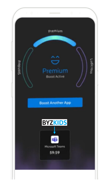
App priority data
by Ericsson
Ericsson USA offers customers with the option to boost data speed for one specific app
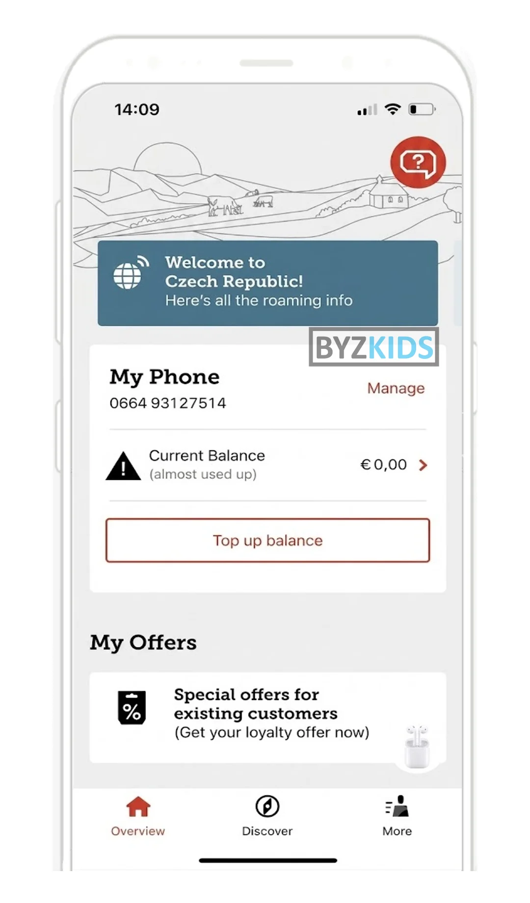
Context-triggered floating banner on roaming activation
by A1
A1 AUT launches a context-triggered floating action element that surfaces dynamically upon roaming activation, bypassing static layout constraints. The floating banner — 'Willkommen in Tschechische Republik' — appears at the moment of cross-border relevance and routes users directly to the A1 Smile Special roaming offer. Unlike persistent UI buttons, this element is event-driven, appearing only when contextually meaningful, reducing friction between trigger moment and purchase.
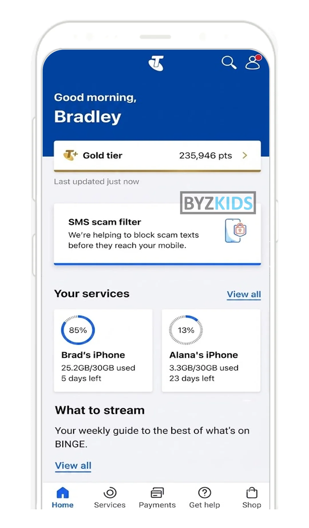
Personalized all-in-one homepage with device usage circles
by Telstra
Telstra AUS launches a redesigned homepage that consolidates account management, service insights, and support into a single personalized entry point. Per-device data usage circles display remaining allowances and renewal countdowns at a glance, eliminating the need to navigate deeper into the app. Scam alerts, streaming tips, and an embedded chat support tab further transform the homepage into an all-in-one hub for discovery and assistance.
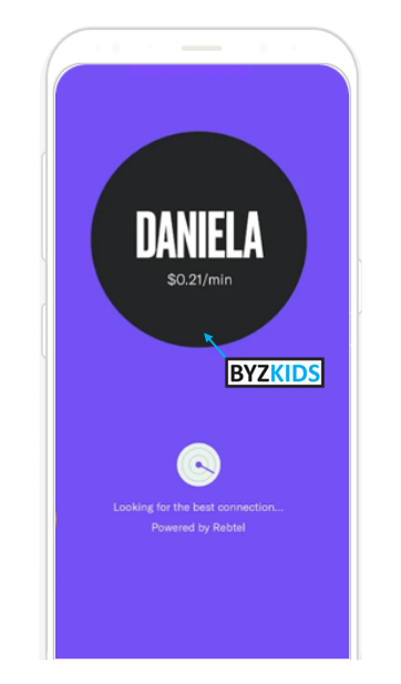
Banking&telco services in one app
by Majority
Majority USA mobile banking app targets immigrants to the US. Users can open a bank account without a Social Security number, and they can even call their contacts directly from the app.
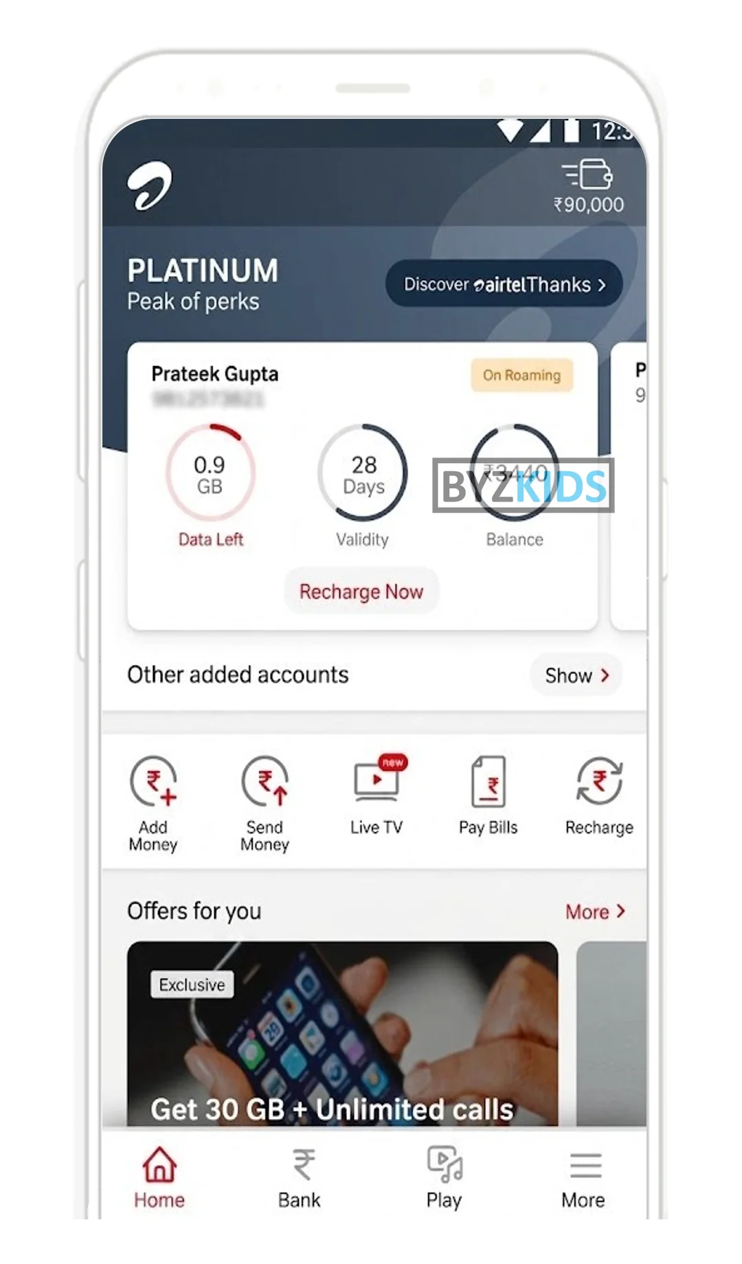
Unified widget dashboard with loyalty and cross-sell
by Airtel
Airtel IND launches a widget-based home screen that consolidates data balance, validity, account status, and quick-action shortcuts for recharges, payments, and live TV into a single dashboard view. Personalized offers and a loyalty tier badge are surfaced directly on the home screen to drive cross-sell without requiring navigation. Bottom tabs extending into banking and entertainment position the app as a unified hub for mobile, financial, and media services.
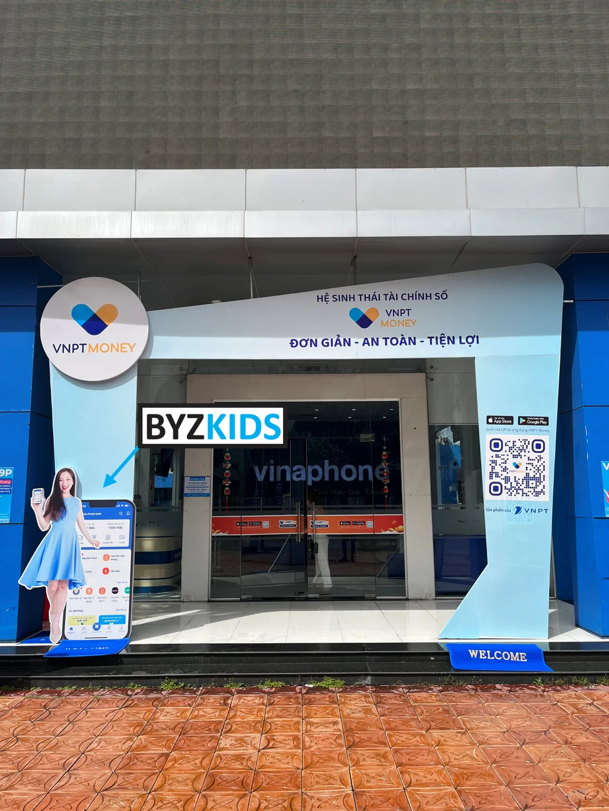
Huge entrance banner promoting mobile app
by VinaPhone
VinaPhone VNM uses a huge entrance banner outside its branch to promote only its mobile app. The single-message format creates a bold wow factor before customers even enter, turning foot traffic into app awareness and making digital adoption feel immediate.
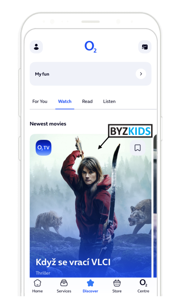
Discover hub
by O2
O2 CZE redesigned their mobile app with strong focus on moving away from traditional paradigm that app is only for servicing products. New app focuses on engagement content via new Discover tab and puts service management aside.
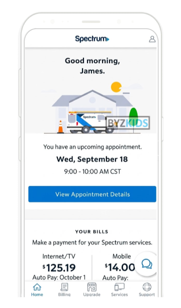
Personalized dashboard with contextual greeting and action cards
by Spectrum
Spectrum USA welcomes customers by name and time of day, then links the dashboard to appointment and billing cards. The warm entry point feels personal and helps customers spot the next important action faster.
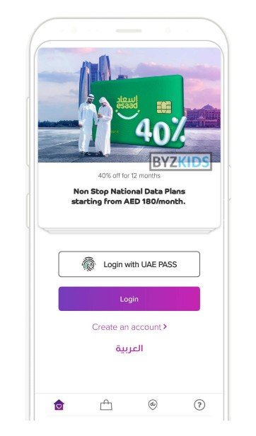
Swipeable pre-login promotional banners on app entry
by du
Du UAE uses swipeable promotional banners on the app login screen to showcase key offers like discounted data plans, device deals with free data, and 5G home wireless gaming bundles. Pre-login exposure turns the app entry point into a discovery surface, letting users browse offers before they even sign in.
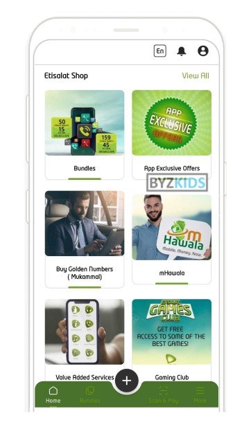
Tappable shop grid home screen storefront
by Etisalat
Etisalat AFG built the app home screen as a tappable shop grid with tiles for bundles, app-exclusive offers, golden number purchases, mHawala mobile money, value-added services, and a gaming club. The grid layout surfaces the full product catalog in one view, turning the self-care app into a storefront that drives upsell and discovery at every login.
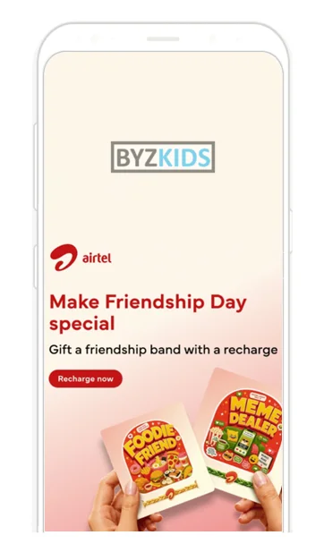
Viral chain gifting with personalised digital friendship bands
by Airtel
Bharti Airtel IND launches an in-app social gifting feature allowing prepaid users to recharge a friend's Airtel number and send a personalised digital Friendship Band via WhatsApp or SMS. Recipients can choose from themed band categories such as 'Gym Buddy', 'Meme Dealer', or 'Foodie Friend', and can continue the chain by gifting another friend. The main differentiator is the viral, chain-driven social mechanic layered on top of a standard recharge transaction, turning a utility action into a shareable celebration moment.
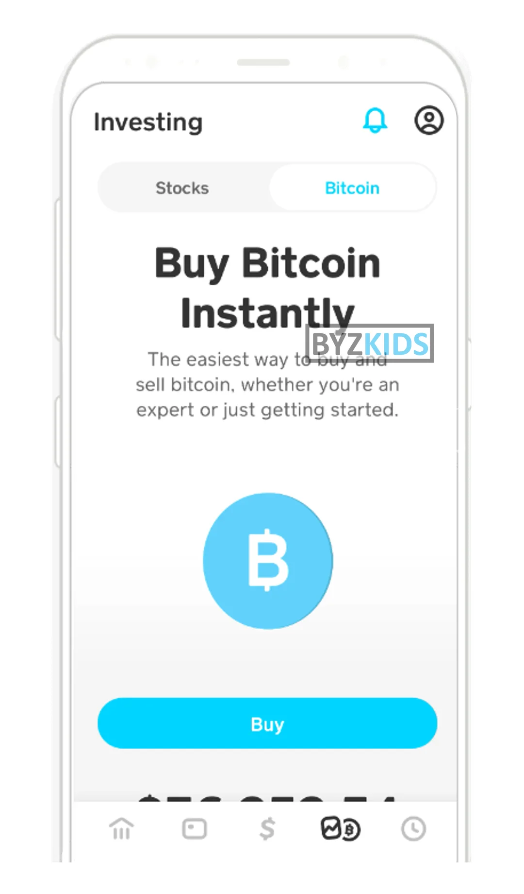
Full-screen investing tab promotional banners with CTA
by Block
Cash App USA launches full-screen promotional banners inside its Investing tab to nudge users toward Bitcoin and stock purchases with a single tap. Bold visuals paired with a direct buy button transform the home screen into a seamless onboarding funnel for first-time investors. The key differentiator is reducing friction to near zero by embedding a contextual call-to-action directly within the investment discovery surface.
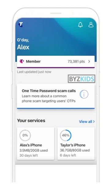
Security threat awareness banners
by Telstra
Telstra AUS highlights security awareness directly on the homepage with banners about threats like OTP scam calls. It combines education with visibility in a high-traffic area, making risks easy to understand. This increases awareness and helps users stay alert to common fraud tactics.
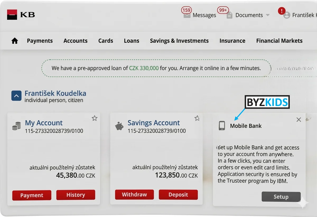
Homepage mobile app download banner promotion
by Komerční banka
Komerční banka CZE promotes its mobile app with a download banner placed right on the web portal homepage. It creates a strong cross-channel push at a key entry point and makes app adoption faster, smoother, and more visible for customers.
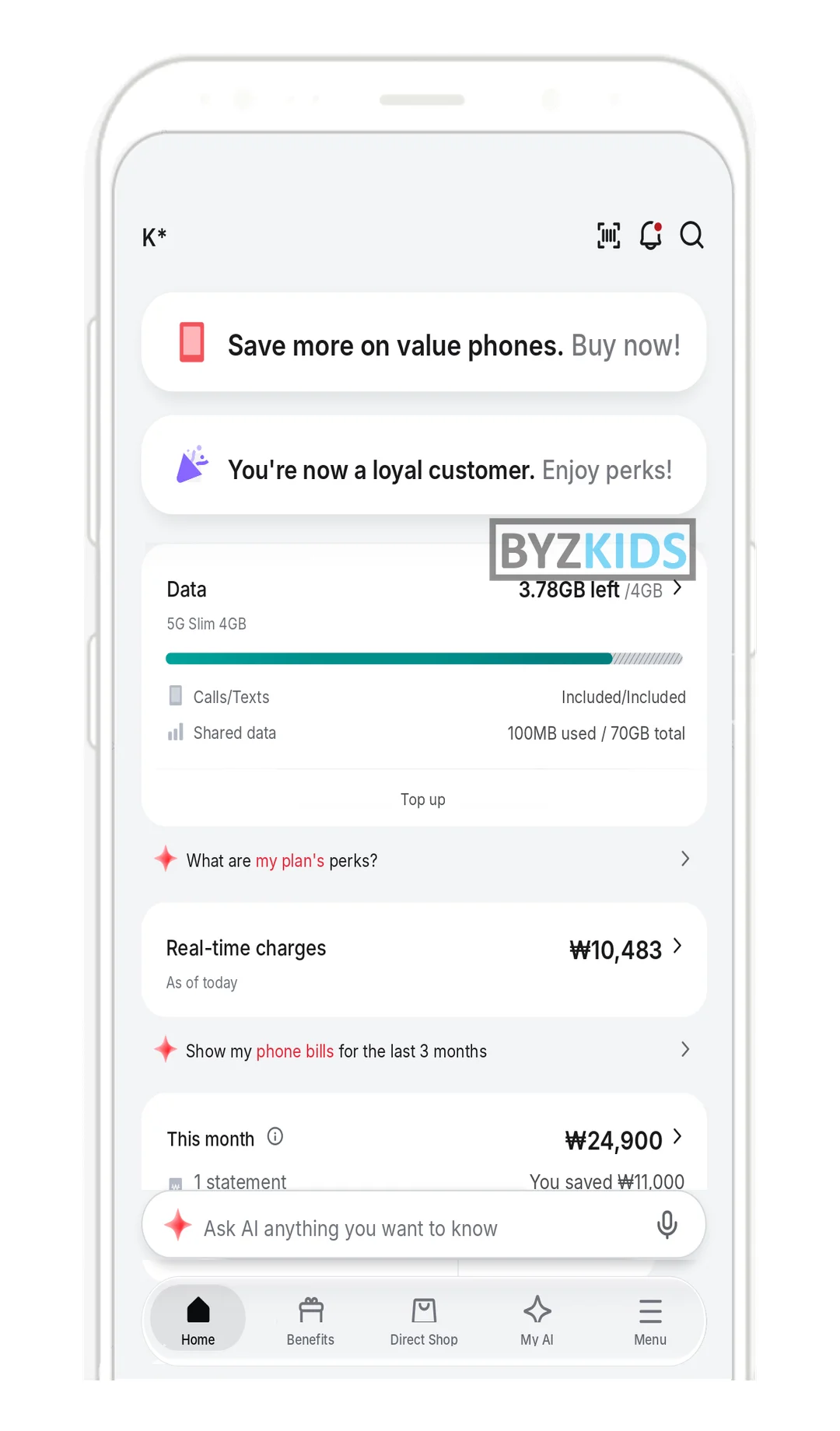
Multi-agent AI personalises telco self-care home screen
by KT Corporation
KT KOR launches a fully AI-rebuilt My KT app that personalises each customer's home screen to surface the benefits most relevant to them. Users can delegate plan changes, add-on management, and membership tasks to a roster of 14 specialised AI agents. The main differentiator is the multi-agent architecture, replacing traditional menu navigation with intent-driven, automated task handling.
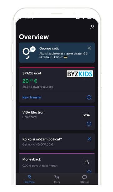
Homepage feature tips
by Slovenska sporitelna
Slovenska sporitelna SVK shows quick tips on the app homepage that remind customers what they can do inside the app instead of pushing sales offers. Helpful prompts highlight useful actions and capabilities, turning the home screen into a discovery hub that builds trust and everyday engagement.
How's your experience?